Last week I headed into Perth for an event on the 10th floor of a swish office building. Think revolving glass entry door, glossy foyer, soaring ceilings. More hotel lobby than office.
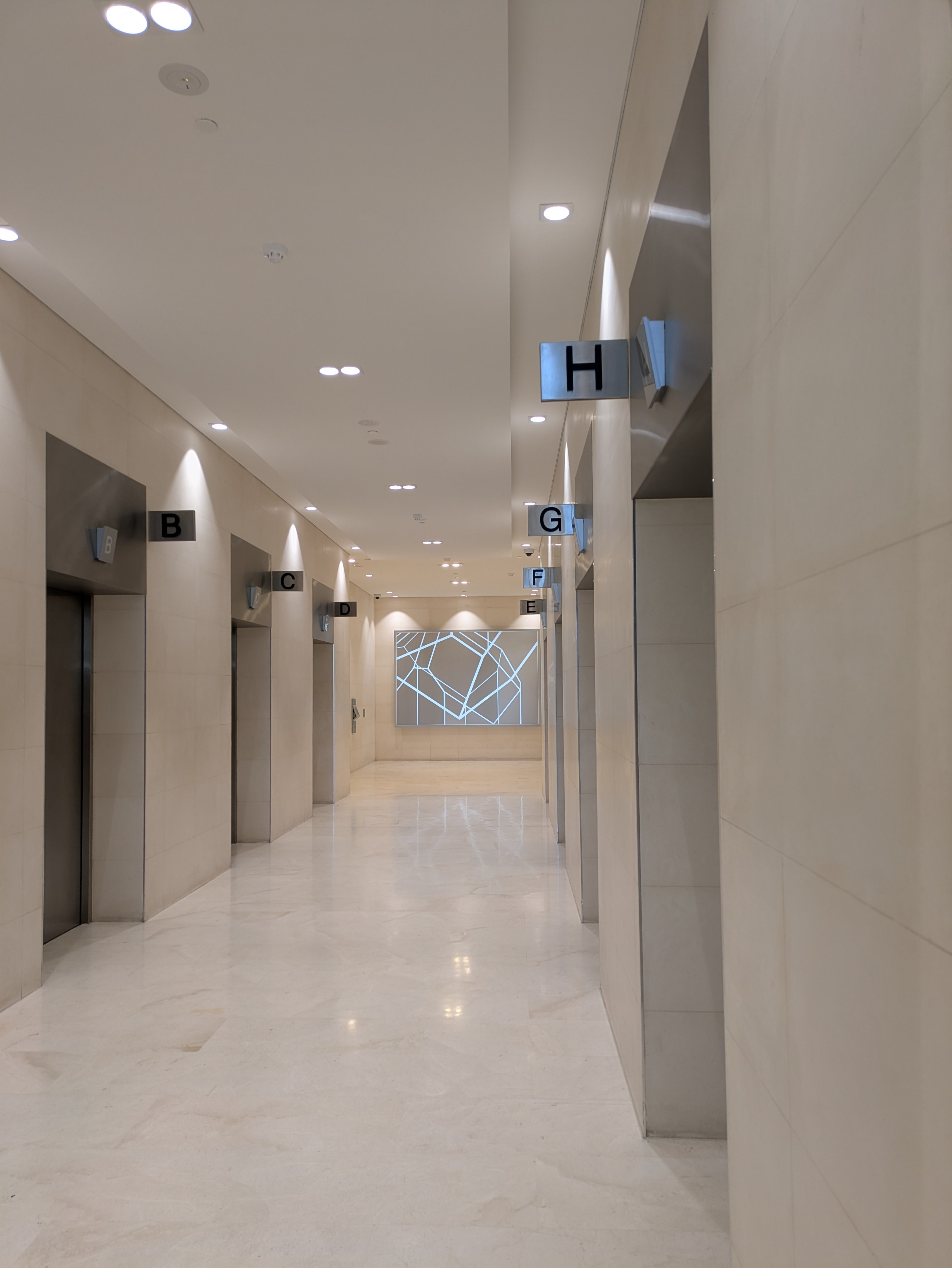
In front of me: eight shiny lifts, A through H. Easy enough, right?
I followed two guys into a lift. Doors closed, going up. I turned to press the button for my floor… except there were no buttons. Not one.
This country gal was baffled. In my town, the tallest building is two storeys, and I've only ever known lifts to work the way you’d expect. Step in, press the button inside, go up. Simple.
One of the guys explained: “Oh, you have to choose your floor on one of the touchpads in the foyer. Then it tells you the letter of which lift to take.”
So instead of heading to floor 10, I embarked on a journey to floor 21, hopped out, and gratefully accepted a tutorial on how to return to the ground floor to start over.
Did I feel daft? You bet. But was it my mistake? Nope.
This is design that assumes you already know the rules of the game. No clear prompts, no instructions. Just shiny user interface, sleek design that led to confusion.
UX lesson of the day: if your system needs another human to explain how to use it, it’s not clever. It’s broken.